When I talk about ways of evaluating players, I often add that metrics for players can be combined in meaningful ways for teams. Here are two quick examples.
First, ratings from different models can be combined to show who’s most important to a team. The graph below shows 2014-15 ratings from two of my models (explained here) along with Shapley values for the club I support, Newcastle United. Shapley values aren’t as persistent from season to season as the other models’ ratings, but they can help to suggest who’s a misfit on a team and who’s pivotal. The diagonal lines consist of combinations of ratings that have the same total. If each model has equal importance, then players along the same diagonal line should be equally useful as well.
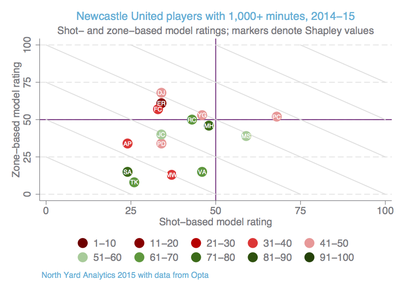
Tim Krul seems to be pivotal to winning matches despite scoring poorly in the two models; they evaluate him primarily as an outfield player, so his actual goalkeeping is probably the reason for his relatively high Shapley value. Sammy Ameobi also has a high Shapley value, suggesting that his speed and imposing frame might keep defenders occupied even though his own production is low. And though Emmanuel Rivière is one of the higher-rated players in the models, at least for advancing the ball into dangerous areas, he seems to be a bad-luck token for Newcastle – perhaps because of his poor finishing this season, or because his lack of success in creating shots is critical at his position.
The next graph is essentially an overlay of player mappings from the shot-based model. It shows where Newcastle’s actions have had better or worse results – in terms of creating shots or allowing the opposition to do so – than the league average for actions at the same location. Here blue areas are above average, and red areas are below average:
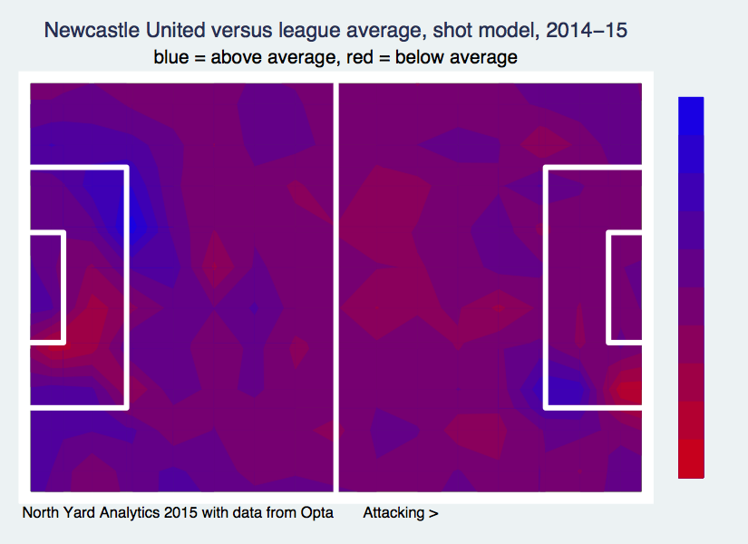
Newcastle is weak just across the halfway line, as well as on the right side of its own goal and in spots on both sides of the opposing penalty box. The team is strongest on the left side of its own box and on the right corner of the opposing box.
It’s easy to go back and look for the players who were responsible for those touches; if you’ve seen enough Newcastle matches, you can probably guess who they were. Moreover, a map like this can be compiled for each match or for a series of matches featuring the same player or players. I can also generate the same kind of map for the zone-based model or any of my other models.
Together, these tools can help clubs to figure out priorities during the transfer window, both for bringing players in and shipping them out. Of course, because soccer is such a dynamic game, no one can predict exactly how players will fit together. But it’s better to have some idea of who’s a square peg and where there’s a round hole.